Quantum mechanics is a scientific model of thought that emerged in the 20th century as a break with classical physics. It is relatively difficult to conceive because it is governed essentially by abstract mathematical ≟. It describes phenomena that take place at the ⌶ of • ⬤ · ⇝ and ⚛, that ⏿ ✋ 🕺 can't distinguish or perceive, and which have a considerable impact on the functioning of the macroscopic world.
Type designer Océane Juvin😐 and physicist Julien Bobroff joined forces to explain and tell the story of quantum physics and its issues via the creation of a visual grammar and typographic system. The pictorial sign is integrated into the popularisation discourse to facilitate the understanding of concepts that are difficult to grasp.
This project was conducted at the Atelier National de Recherche Typographique (ANRT) between October 2019 and March 2021.
The result of this collaboration is the Quantype, family, which consists of two typefaces designed to work together :
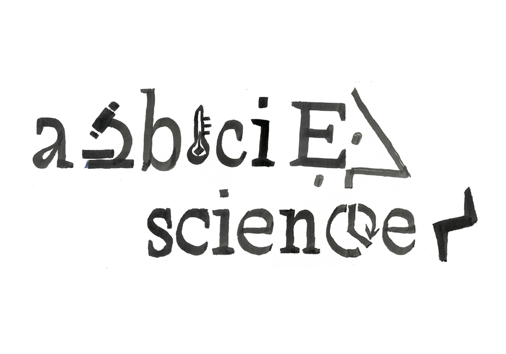
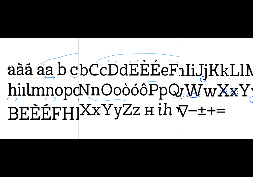
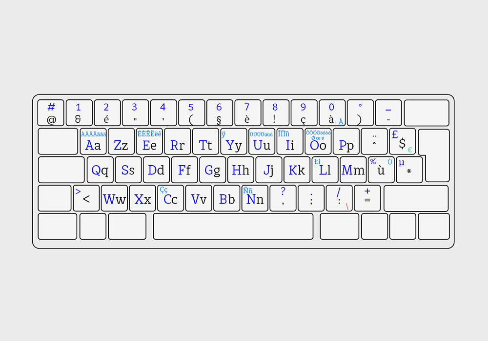
Quantype ABC provides access to the Latin alphabet with its punctuation, numerals and various other specific signs. It is a Latin typeface of the mecanic type, medium fat, low contrast and derives its forms from calligraphy, resulting in a rather humanistic design.
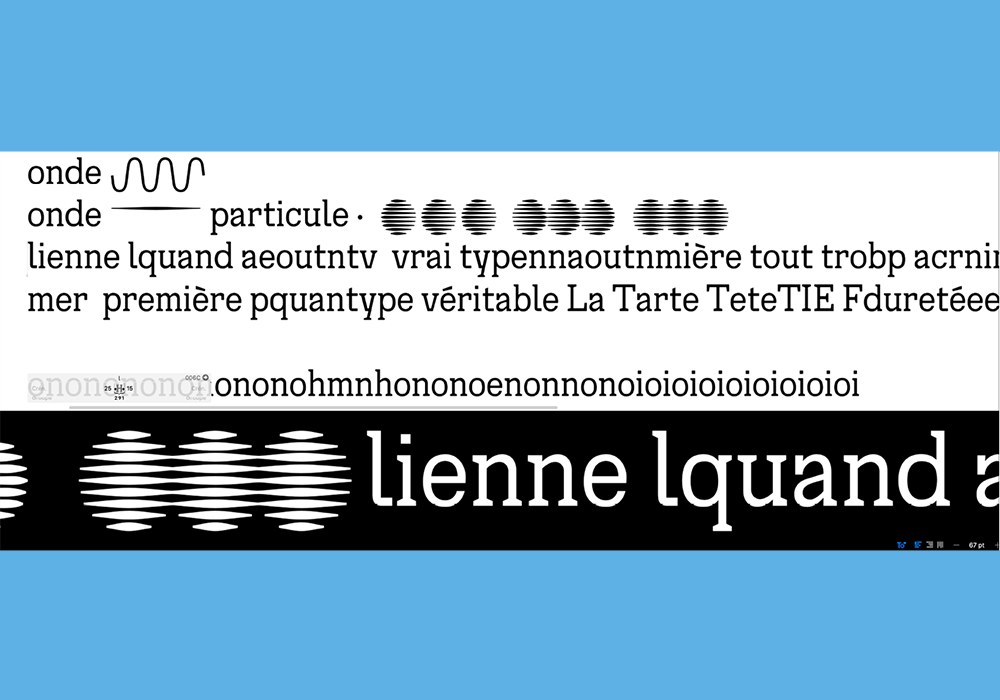
Quantype Symbols consists of a set of symbols of different types that allow to represent the phenomena and concepts involved in quantum physics by combining and superimposing them.
Are the aleatory leaps quantum ? * 0123456789/@&∇↑∂μτπΩΨ#1234567890ABCbcdfghjkmpvwxyz
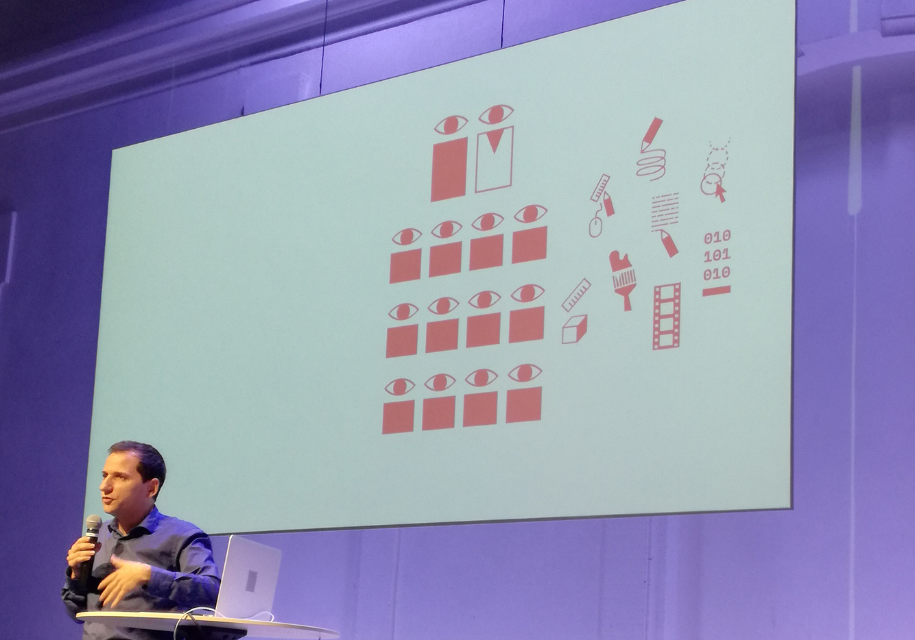
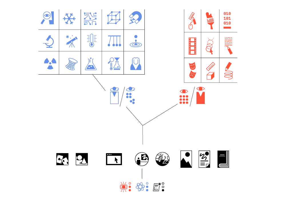
The collaboration between graphic and type designer Océane Juvin, and physicist and populariser Julien Bobroff started with the creation of a pictographic system to explain the activities of the research group La Physique Autrement, which explores new ways of popularising and teaching science through collaborations between physicists and designers or artists.
It initiated an easy conversation where signs are conceived as batons-tools.
From the rich discussion the suject of quantum mechanics became an opportunity to consider a freer, more exploratory and experimental format for exchange and work.
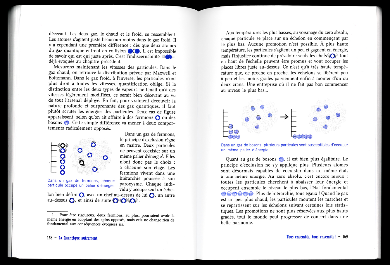

A fisrt step was to interfere the symbols in the book of Julien Bobroff : La Quantique Autrement, Julien Bobroff, Paris, Flammarion, 2020.
He must then be given tools to play with, material on which he can base his text. The discourse changes according to the graphic possibilities, and the graphic possibilities simplify the discourse. There is no longer one author and one illustrator-designer, but two co-authors.
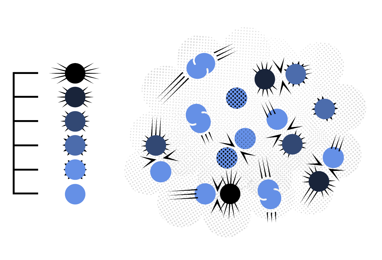
It was a fist attempt to design quantum shapes like particles and their properties, states changings, effets, transformations, interactions and collective behaviours.
It was exciting to create a common language through spontaneous exchange. Creating forms, showing them, discussing them, reshaping them, looking for new ones.
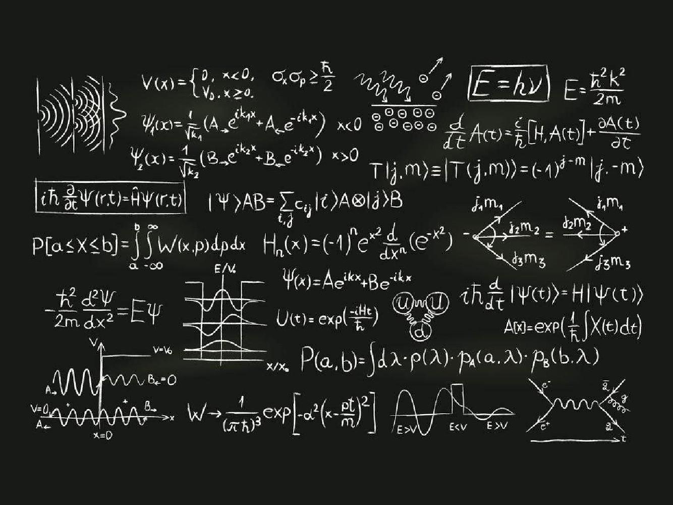
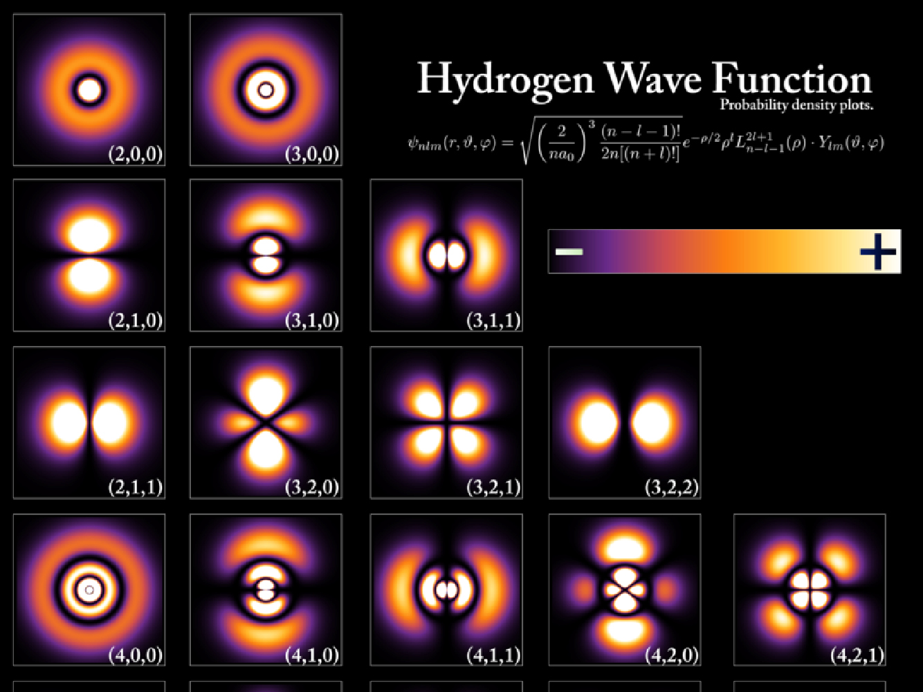
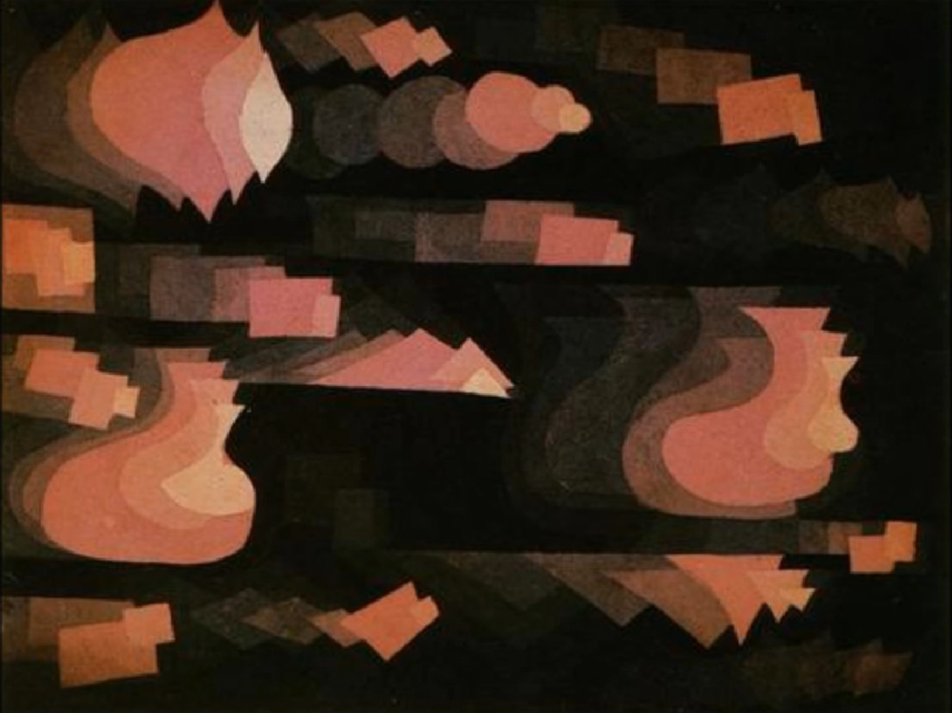

The objective was to evacuate any naturalistic and figurative desire and to conceive a hybrid system of signs between text and image, which could be manipulated to build up material for popularisation.
One of the interesting challenges of this project was to use the typographic tool to create a language that would stand alone from text to create images. But then, the signs had to work both small at the scale of a body of text, as well as larger to compose images that remain aesthetically interesting. It's about finding a balance, as is often the case in typography.
Thanks to the work of moiré, very present in the optical illusions of the Op Art movement, the images gain in elegance with effects of volume and transparency which sublimate their combinations by superposition or juxtaposition without complicating their reading.
The drawing of symbols is close to the graphic design of the 1980s and its collection of minimalist logos that play with geometry and optical illusions.
It was a matter of drawing subjective forms in consciousness because the typographer's intervention in this kind of object becomes similar to that of an author, who adds her graphic interpretation to the discourse. Do not try to create transparent and "neutral" forms, be present through aesthetics.
The role of the images to be produced is not only to exemplify, to explain visually, but also to animate the discourse. Hence the importance given to spontaneity and the expressiveness of certain forms. The transmission of these concepts must be made less complicated.
Using the single interface of a typeface creation software allows a simplification of the work process, but also a greater agility in the management of the alphabet and associated signs.
The creation of a bespoke alphabet to accompany the symbols appeared to be the most appropriate solution. Designed on the model of 19th century mechanics, the final typeface is practical and pleasant to read on long texts, both on screen and on paper, and fits large on headlines, as well as being in perfect harmony with the symbols' design.
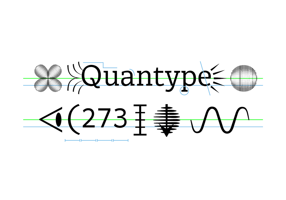
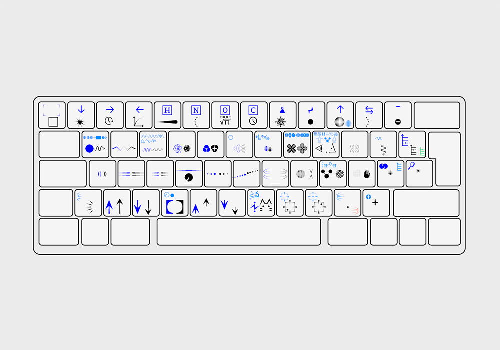
After different uses, two types of Quantype usage formats were distinguished :
• The first type of format has a didactic function, it is built on the discourse of the populariser and gives it a tool. For example, it is a video or an article that explains one or more principles of quantum physics.
• The second type of format has a more aesthetic and playful function. They can be visual cards accompanying didactic formats or serve as aesthetic illustrations without any vulgarising aim. Indeed, the Quantype character and its symbols invite to play rebus and to build mysterious images by combining the symbols.
A future event is being jointly developed between designer and populariser. It will feature both quantum physics and its popularisation tool, Quantype.
This website is a work-in-progress.
|